Why You Need a Customer Support Dashboard
A customer support dashboard is your command center. It is a visual tool that tracks key service metrics in real time. Think of it like your car's dashboard. You get a quick, at-a-glance view of your support team's health. Its main job is to turn raw data from emails, chats, and phones into clear actions. This helps improve your team's work and makes customers happier. For example, a support dashboard from a provider like Sobot can use Sobot AI to analyze data from a Sobot call center, helping you make smarter decisions instantly.
What Is a Customer Support Dashboard?
A customer support dashboard acts as the single source of truth for your entire service operation. It gathers scattered information and presents it in one organized, visual space. This allows you and your team to see the complete picture without jumping between different tools.
A Central Hub for Support Data
Imagine all your customer data flowing into one place. That is what a central hub does. It connects the different systems you use every day. This creates a unified view of every customer interaction. Your team gets the context it needs without searching for information.
A good dashboard integrates data from many sources, including:
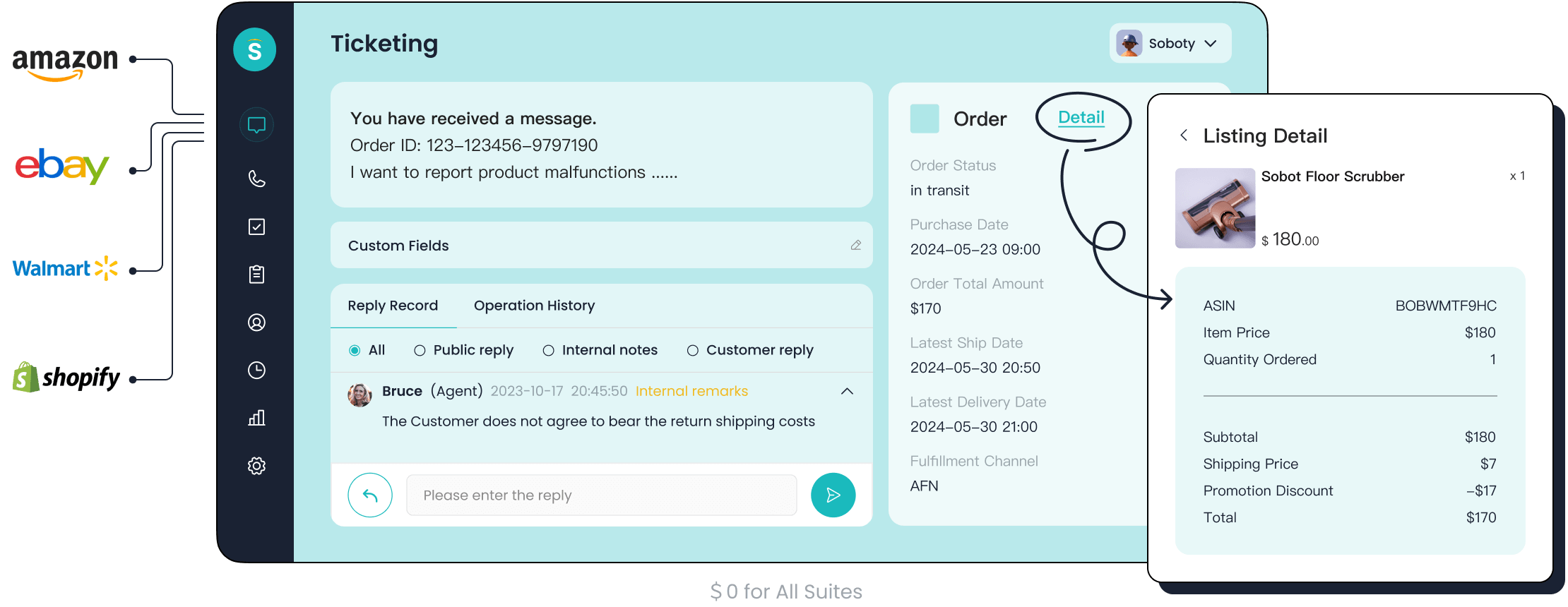
- Helpdesk and ticketing systems like the Sobot Ticketing System
- Live chat and phone systems
- Customer survey platforms
One fast-growing e-retailer faced major challenges with its support. Response times were slow, and service quality was inconsistent across phone, chat, and email. By implementing a unified omnichannel system, they centralized their data. This change brought incredible results. They saw a 98% improvement in live chat response speed and reduced email turnaround time by 4 hours. This shows how a central hub turns chaos into efficiency.
From Raw Data to Actionable Insights
Raw data is just a collection of numbers and facts. An actionable insight tells you what to do with that data. A customer service dashboard excels at turning confusing data points into clear, strategic actions. It helps you understand the "why" behind the numbers.
For example, raw data might show you that many customers are abandoning their shopping carts. An insight reveals why it's happening.
| Raw Data Point | Actionable Insight |
|---|---|
| Website data shows users abandoning carts before checkout. | Digging deeper reveals users drop off at the payment step. This points to a complicated checkout process. The action is to simplify it. |
| The support team receives many tickets about a specific feature. | The feature may be confusing or broken. The action is to create a help guide or alert the product team to fix the bug. |
| Ticket creation times spike between 2 PM and 4 PM every day. | This is your peak support period. The action is to schedule more agents during these hours to manage the workload effectively. |
A support dashboard makes these connections for you. It transforms simple metrics into a roadmap for improvement, helping you make smarter decisions for your team and customers.
Real-Time Monitoring vs. Static Reports
You might already use weekly or monthly reports. So, how is a dashboard different? The key difference is its dynamic, real-time nature. A static report is a snapshot in time, while a dashboard is a live video feed of your operations. A call center dashboard, for instance, gives you immediate visibility into call volumes and agent availability.
Note: Static reports are great for deep, historical analysis. A contact center dashboard is built for immediate action and in-the-moment decisions.
Here is a simple breakdown of the differences:
| Feature | Real-Time Dashboard | Static Weekly Report |
|---|---|---|
| Data | Displays up-to-the-minute, live data. | Shows historical data from a specific period. |
| Objective | Offers a quick, at-a-glance overview for immediate action. | Provides a deep, detailed analysis for strategic planning. |
| Interactivity | Highly interactive with filters and drill-down options. | Non-interactive and presents data in a fixed format. |
| Use Case | Monitoring daily performance and handling sudden issues. | Reviewing quarterly performance and identifying long-term trends. |
While reports help you look back, a dashboard empowers you to act now. It gives you the agility to solve problems as they happen, not days or weeks later.
The Core Benefits of a Dashboard
Adopting a dashboard moves your support team beyond simply answering tickets. It unlocks powerful advantages that improve efficiency, empower your team, and delight your customers. You gain the clarity needed to make strategic decisions that drive real growth.
Real-Time Performance Visibility
A dashboard gives you and your team a live view of what is happening right now. This immediate visibility is a powerful motivator. When you provide agents with tools for self-management, like real-time dashboards, you empower them to track their own progress. They take ownership of their performance. This shifts their mindset from reacting to problems to proactively managing their work.
This transparency also builds trust and engagement. Studies show that when companies share more information and data, over 50% of employees report a positive impact on their productivity. A live dashboard keeps key goals top-of-mind, inspiring everyone to strive for excellence.
Data-Driven Decisions
A dashboard transforms you from a manager running on gut feelings to a leader making strategic, data-backed choices. Visualizing trends helps you spot bottlenecks, understand team capacity, and allocate resources effectively. Instead of guessing where a problem lies, you can see it clearly.
For example, you can use trend analysis to:
- Compare team performance: See which teams resolve tickets fastest and share their best practices.
- Set performance targets: Use visual benchmark lines on charts to see when performance dips below your goals.
- Isolate specific issues: Filter data to analyze performance for a certain ticket type, agent, or time period.
- Understand workload impact: Analyze how ticket complexity affects resolution times to better plan for future tasks.
By using filters, you can drill down into your data to find precise answers.
| Filter Category | What It Helps You See |
|---|---|
| User | The performance of an individual agent. |
| Tags | Data related to a specific issue, like "billing" or "bug report." |
| Date Range | Performance during a specific campaign or time of day. |
| Status | The number of tickets that are open, in-progress, or resolved. |
This level of detail allows you to identify the root cause of delays and optimize your workflows with confidence.
Improved Team Productivity
A productive team is an efficient one. A dashboard eliminates wasted time and streamlines daily tasks, directly boosting your team's output. For instance, Cymax Group, an e-commerce provider, faced slow response times across many channels. By implementing a centralized dashboard, they gained full visibility and significantly improved productivity and response times.
You can achieve similar results by using a dashboard to:
- Reduce idle time: See which agents are available and route tickets to them instantly.
- Provide instant feedback: Display agent metrics right after a customer survey is completed, allowing for immediate self-correction.
- Offer automated coaching: Use visual cues, like color-coded indicators, to show agents where they are excelling and where they can improve.
Tip: A dashboard with automated coaching tips can suggest specific actions based on feedback. If an agent receives low marks for empathy, the system can offer strategies for future interactions.
Proactive Problem Solving
The best customer service solves problems before they affect a large number of customers. A dashboard helps you identify recurring issues and negative trends early, so you can act proactively. Instead of waiting for complaints to pile up, you can spot a pattern and address the root cause.
Here are a few examples:
- A customer experience dashboard can help you spot when users start to drop off, revealing patterns that might lead to churn.
- A csat dashboard shows satisfaction trends in real time, helping you instantly identify and address common customer pain points.
- A knowledge base dashboard tracks common search terms. If many customers search for a topic with no results, you know you have a content gap to fill.
This foresight turns your support team into a valuable source of business intelligence.
Elevated Customer Experience
Ultimately, all these benefits lead to one crucial outcome: a better experience for your customers. Metrics on a customer support dashboard, like First Response Time (FRT) and Customer Satisfaction (CSAT), are directly linked. A fast response makes customers feel valued and heard, which immediately boosts their satisfaction.
The initial moments of an interaction shape a customer's entire perception. A quick reply builds trust, while a long wait creates frustration. A support dashboard helps you monitor and improve these critical performance metrics.
Top companies use this principle to achieve incredible results. For example, by using Sobot's integrated tools, Samsung achieved a 97% customer satisfaction rate. They unified their communication channels and used real-time analytics to monitor sentiment and satisfaction around the clock. This allowed them to provide a seamless, high-quality experience that built lasting customer loyalty.
Key Metrics Your Dashboard Must Track
A great support dashboard tracks metrics that tell a complete story. You need to see how your operations are running, how customers feel, and how your team is performing. These numbers help you connect daily tasks to your big-picture business goals.
Operational Metrics
Operational metrics show you how efficiently your support process works. They measure the flow of work from start to finish. One key metric is First Contact Resolution (FCR). This tracks how many issues you solve in the very first interaction. A higher FCR means less work for your team and happier customers. For technical support, the average FCR is around 61-65% due to the complexity of issues.
Customer-Focused Metrics
These metrics measure your customers' happiness and effort. A csat dashboard is perfect for tracking Customer Satisfaction (CSAT). This score shows how happy customers are with your service. For e-commerce, a good CSAT score is above 80%.
| E-commerce Category | Average CSAT Score |
|---|---|
| Industry Average | 80% |
| Good Performance | >80% |
| Exceptional Performance | >85% |
Another important metric is Customer Effort Score (CES). It measures how easy it was for a customer to get help. You calculate CES by dividing the total sum of survey scores by the number of responses. A score of 5 or higher on a 7-point scale is generally good.
Team Performance Metrics
Team performance metrics help you understand agent productivity. These key performance indicators show you where your team excels and where they need support. A common metric is Average Handle Time (AHT), which is the average time an agent spends on an interaction. AHT varies widely by industry.
| Industry | Typical AHT (Minutes) |
|---|---|
| Retail & E-commerce | 3 – 4 |
| Financial Services | 5 – 6 |
| Technical Support | 8 – 15 |
Business-Level Metrics
Business-level metrics connect your support efforts to company growth. These numbers show executives how customer service impacts the bottom line. Your dashboard can track things like customer churn rate or the number of support interactions from high-value customers. This helps prove the value of your support team.
How to Implement an Effective Support Dashboard
Putting a dashboard into practice is more than just picking a tool. You need a clear plan to turn data into results. This process involves setting goals, choosing the right platform, connecting your data, and training your team for success.
Define Your Key Goals
Before you build anything, you must know what you want to achieve. Clear goals guide your design and help you select the right metrics. You can set a SMART goal to guide your implementation. For example, you might aim to implement a new performance analytics dashboard in the next two months. The goal could be to achieve a 15% improvement in overall service metrics within six months. This gives your project a clear purpose and a deadline.
Choosing the Right Support Dashboard
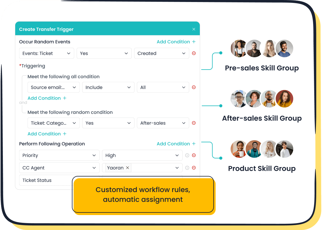
The right tool makes all the difference. Instead of juggling separate tools, you can choose an all-in-one platform. Sobot's Omnichannel Solution inherently provides a powerful customer support dashboard. It gives you a clear view of operations with features like:
- Unified inboxes and dashboards
- Analytics tools to track the customer journey
- AI-powered data analysis to manage teams faster
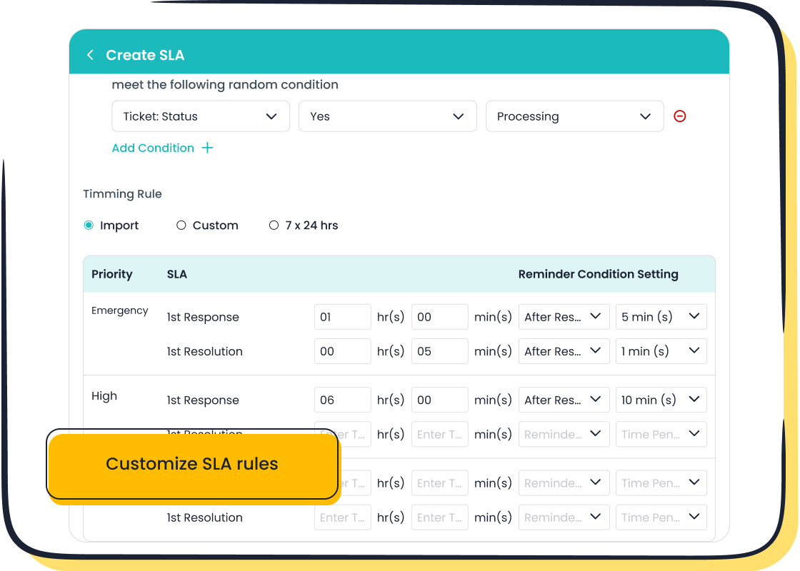
Tools like the Sobot Ticketing System also come with built-in analytics. These features form the foundation of a great support dashboard. They automatically track key metrics like first response time, resolution rate, and SLA compliance, giving you actionable insights to improve performance.
Integrating Your Data Sources
Your customer data lives in many places. A powerful dashboard brings it all together. You need to connect your systems for email, chat, phone, and social media. An integrated platform like Sobot simplifies this process. It unifies your data sources automatically. This gives your team a complete view of every customer interaction in one place.
Training Your Team with Sobot
A dashboard is only useful if your team knows how to use it. Training should be practical and focused on decision-making. Teach your team how to turn analytics into compelling narratives that inspire action.
Tip: When training your team, focus on the "why" behind the data. Use role-specific examples and your company's own data to make the lessons relevant. This helps agents confidently connect their performance metrics to your overall business strategy.
A customer support dashboard shifts your team from reactive to proactive. It provides clarity, boosts efficiency, and improves customer satisfaction. Modern service runs on data, and a support dashboard is the best way to use it. You can transform your operations with a unified view of every interaction.
Ready to make data-driven decisions? Explore Sobot's integrated solutions to gain a complete picture of your support operations and start your journey toward excellence.
FAQ
What is the main difference between a dashboard and a report?
A customer support dashboard gives you live data for in-the-moment decisions. A report shows past data for long-term planning. You use a dashboard to act now and a report to review later.
How quickly can I set up a support dashboard?
You can set up a support dashboard quickly with an all-in-one platform. Solutions like Sobot's Omnichannel Solution include built-in dashboards. This gives you instant access to key analytics without a complex setup.
Can a small team benefit from a dashboard?
Absolutely. A customer support dashboard helps small teams work smarter by showing exactly where to focus. This ensures you use your time and resources effectively to improve customer satisfaction, no matter your team's size.
What is the most important metric to track?
The best metric depends on your goals. For faster service, focus on First Response Time (FRT). For happier customers, track Customer Satisfaction (CSAT). You should align your dashboard metrics with your team's primary objectives.
See Also
Elevate Customer Support: Master the Art of Live Chat
Enhance Call Center Performance Through Effective Monitoring Strategies
Supercharge Your SaaS Support Using Smart Live Chat Tactics
Unlock Business Success with Continuous 24/7 Live Chat Support
Selecting Social Media Customer Service Software: Top 10 Essential Tips