Steps to Write a Comprehensive Data Analysis Report

A well-structured data analysis and reporting document plays a crucial role in decision-making. It transforms raw data into actionable insights, helping organizations make informed choices. However, creating such a report often comes with challenges. Data scattered across systems can hinder access, while poor data quality and misleading visualizations can compromise accuracy. Tools like Sobot simplify these processes by centralizing data and ensuring consistency. When you write the introduction of your report, provide context by outlining its purpose and scope. This sets the stage for a clear executive summary and actionable findings, especially in a marketing data analysis and reporting document.
Define the Objective or Question
Understand the Purpose of the Data Analysis Report
Identify key stakeholders and their specific needs.

Before starting the data analysis process, you must identify the key stakeholders who will use the report. These stakeholders could include decision-makers such as executives, managers, or team leads. Each group has unique needs. For example, executives may focus on high-level trends, while managers might require detailed metrics to guide their teams. Understanding these needs ensures the report delivers actionable insights tailored to its audience. Tools like Sobot’s Ticketing System can help centralize data from multiple sources, making it easier to address stakeholder-specific questions.
Clarify the primary questions the analysis aims to address.
Defining the question is a critical step in writing a data analysis report. Start by asking, “What problem am I solving?” or “What decisions will this report influence?” For instance, a retail company might want to know which products drive the most revenue. Clear questions guide the data analysis process and ensure the findings align with the report’s objectives. This clarity also helps avoid unnecessary data collection, saving time and resources.
Set Clear Goals for Data Analysis and Reporting
Define the scope and limitations of the analysis.

Setting boundaries for your analysis prevents scope creep and keeps the report focused. Specify what data you will include and exclude. For example, if you analyze customer service efficiency, you might focus only on email and chat interactions. Acknowledge limitations, such as incomplete data or external factors, to manage expectations. Using Sobot’s Ticketing System, you can streamline this process by filtering data based on specific criteria like channels or customer types.
Establish measurable outcomes to guide the report.
Measurable goals ensure your report stays on track and delivers value. Follow best practices by setting goals that are specific, measurable, achievable, relevant, and time-bound (SMART). For example, instead of saying, “Improve customer satisfaction,” aim for “Increase customer satisfaction scores by 10% within three months.” This approach not only provides clarity but also helps decision-makers evaluate the report’s success. A well-structured data analysis and reporting document with SMART goals can significantly enhance decision-making.
Tip: Defining clear objectives improves the report’s clarity, organizes your thoughts, and prioritizes key metrics. It also helps craft a compelling narrative that engages decision-makers effectively.
Collect and Clean the Data
Gather Relevant Data
Identify reliable data sources and ensure their credibility.
When collecting the data for your analysis, focus on reliable sources to ensure accuracy. Trusted sources include surveys, interviews, and observations, which provide firsthand insights. You can also use existing databases, industry reports, or government portals for secondary data. For example, open data repositories often offer valuable datasets for market research. Always verify the credibility of these sources by checking their origin and methodology. Avoid common pitfalls like using outdated or biased data, as this can compromise your analysis.
Use tools like Sobot's Ticketing System to centralize and organize data.
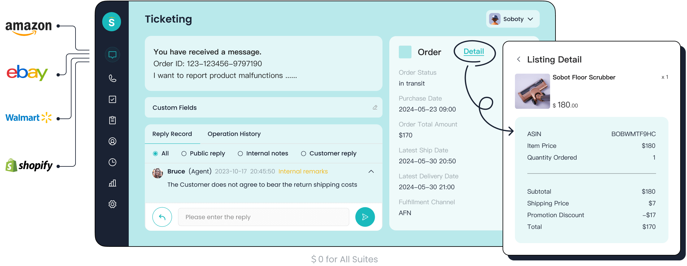
Managing data from multiple channels can be overwhelming. Tools like Sobot's Ticketing System simplify this process by centralizing data from email, voicemail, and chat into one platform. This unified approach ensures consistency and saves time. For instance, if you're analyzing customer service efficiency, Sobot's system allows you to filter tickets by priority or channel, making it easier to focus on relevant data. Its multilingual support and analytics features further enhance data organization, ensuring you have a clean and structured dataset for analysis.
Clean and Prepare the Data
Remove duplicates, errors, and inconsistencies.
Cleaning the data is a critical step to ensure accurate results. Start by identifying and removing duplicate entries, as they can skew your analysis. Next, correct errors and inconsistencies, such as conflicting information or incorrect formats. For example, if customer names are spelled differently across records, standardize them to maintain uniformity. Tools like Python's Pandas library or Excel can help automate these tasks, saving you time and effort.
Standardize data formats and handle missing values effectively.
Standardizing data formats ensures consistency across datasets. For instance, dates should follow the same format (e.g., MM/DD/YYYY) throughout your analysis. Handling missing values is equally important. You can either remove incomplete records or use imputation techniques to fill in the gaps. For example, if a dataset lacks customer age information, you might use the average age as a substitute. Software like R or Python offers robust tools for these tasks, making the cleaning process more efficient.
Analyze the Data Using Appropriate Methods
Choose the Right Analytical Techniques
Select methods based on the type of data and objectives.
Choosing the right analytical techniques is essential for extracting meaningful insights from your data. The method you select should align with the type of data you have and the goals of your analysis. For example, if you are working with numerical data, statistical analysis can help identify relationships between variables. On the other hand, predictive analytics is ideal for forecasting future trends using historical data.
To guide your selection, consider key criteria such as accuracy, precision, and sensitivity. The table below outlines these criteria in detail:
| Criteria | Description |
|---|---|
| Specificity | Ability to measure the intended analyte without interference from others. |
| Accuracy | Closeness of a measured value to a standard or known value. |
| Precision | Consistency of repeated measurements under unchanged conditions. |
| Sensitivity | Ability to detect small changes in analyte concentration. |
| Linearity | Ability to obtain results proportional to the concentration of analyte. |
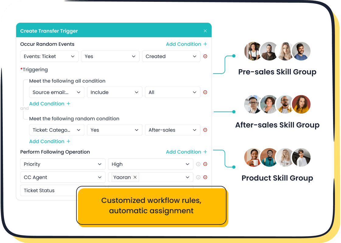
Using tools like Sobot's Ticketing System can simplify this step. Its trusted analytics feature provides a robust foundation for analyzing the data, ensuring accuracy and consistency across multiple channels.
Use statistical, descriptive, or predictive analysis as needed.
Different types of analysis serve different purposes. Statistical analysis helps you examine relationships between variables and perform inferential analysis. Descriptive analytics focuses on summarizing past data to provide context, often using visualizations like graphs or charts. Predictive analytics, powered by machine learning, forecasts future outcomes based on historical patterns. For instance, a retail business might use predictive analytics to anticipate seasonal demand spikes.
By combining these methods, you can uncover data-driven insights that address your objectives effectively. Sobot's analytics tools can further enhance this process by offering real-time visualizations and actionable metrics.
Interpret the Results
Identify patterns, trends, and correlations in the data.
Interpreting your findings involves identifying patterns, trends, and correlations that answer your initial questions. Techniques like regression analysis and cluster analysis can reveal hidden relationships within complex datasets. For example, regression analysis might show how customer satisfaction scores correlate with response times. Data visualization tools, such as bar charts or scatter plots, make these patterns easier to understand.
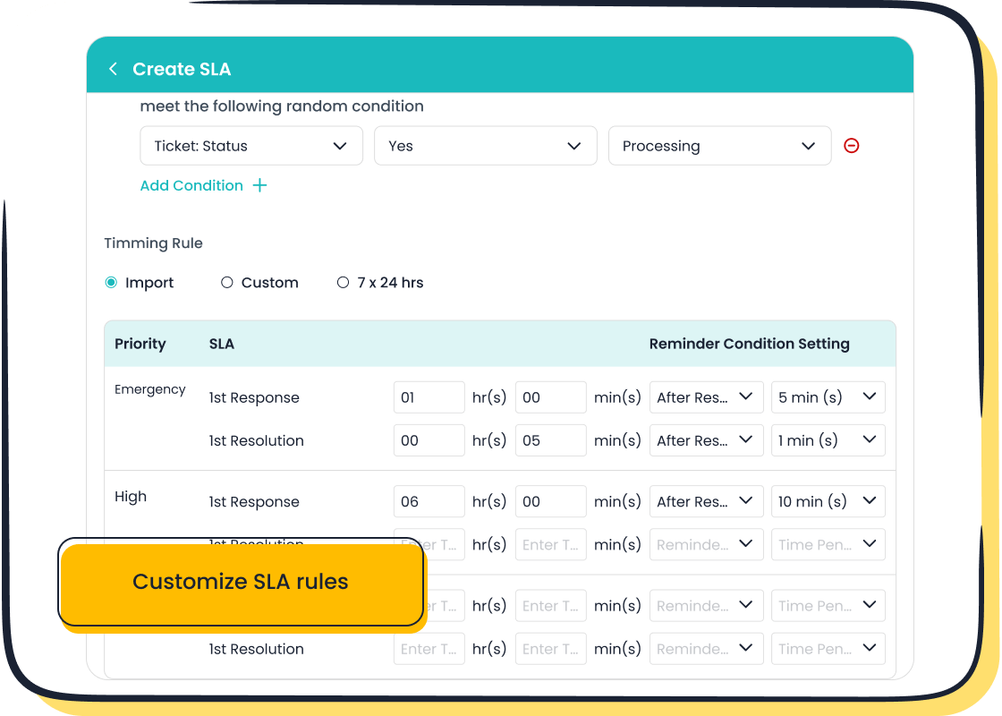
Sobot's Ticketing System supports this step by providing comprehensive analytics dashboards. These dashboards highlight key trends, such as ticket resolution times or customer feedback scores, enabling you to draw actionable conclusions.
Ensure the findings align with the report's objectives.
Your findings should directly address the objectives outlined at the start of the data analysis process. To ensure alignment, follow best practices like visualizing data to confirm trends and seeking feedback to validate your conclusions. For example, if your goal is to improve customer service efficiency, focus on metrics like average resolution time or first-response rate.
Avoid common biases, such as confirmation bias or selection bias, which can distort your interpretation. Tools like Sobot's SLA management feature can help you track performance metrics objectively, ensuring your findings remain accurate and actionable.
Tip: Always remain curious and open to refining your approach. This mindset helps you uncover deeper insights and improve the quality of your analysis.
Organize the Report into Clear Sections
Introduction
Provide an overview of the report's purpose and scope.
The introduction sets the stage for your data analysis report. It should immediately engage the reader by defining the topic and explaining its relevance. For example, if your report focuses on customer service efficiency, highlight why this metric is critical for business success. Outline the scope of the report by specifying what aspects of the topic you will cover. For instance, you might analyze ticket resolution times across email and chat channels. This clarity ensures readers understand the report's focus and purpose.
State the key questions or objectives.
Clearly stating the key questions or objectives helps readers grasp the report's intent. For example, you might aim to answer, "What factors contribute to delayed ticket resolution?" or "How can customer satisfaction scores improve by 10%?" These objectives guide the narrative and ensure the report remains focused on actionable insights.
Methods
Describe the data collection and cleaning process.
In this section, explain how you gathered and prepared the data. For instance, you might collect data from tools like Sobot's Ticketing System, which centralizes information from multiple channels. Describe how you cleaned the data by removing duplicates, correcting errors, and standardizing formats. This step ensures the data analysis process is based on accurate and reliable information.
Explain the analytical techniques used.
Detail the methods you used to analyze the data. For example, you might employ statistical analysis to identify trends or predictive analytics to forecast future outcomes. Tools like Sobot's analytics features can simplify this process by providing real-time insights and visualizations. Clearly explaining these techniques helps readers understand how you derived your findings.
Analysis and Results
Present findings logically, using tools like Sobot's Ticketing System for visualization.
Organize your findings in a logical sequence to create a compelling narrative. Use tools like Sobot's Ticketing System to visualize data effectively. For example, a bar chart might show how ticket resolution times vary by channel, while a line graph could illustrate trends in customer satisfaction scores over time. These visualizations make complex data more digestible and engaging.
Use tables, charts, and graphs to support the narrative.
Visual elements like tables, charts, and graphs enhance the readability of your report. For instance, a pie chart can display the proportion of tickets resolved within SLA timelines, while a table can summarize key metrics like average resolution time and customer feedback scores. Ensure all visuals have clear labels and legends to avoid confusion. This approach strengthens your narrative and helps readers quickly grasp critical insights.
Conclusion and Actionable Recommendations
Summarize the key insights and findings.
To wrap up your data analysis report, focus on key insights that directly address the objectives outlined at the beginning. Highlight the most significant findings without diving into unnecessary details. For example, if your analysis revealed that ticket resolution times improved by 20% after implementing a new system, emphasize this achievement. Use simple language to ensure clarity and avoid technical jargon that might confuse your audience.
A structured approach can help you summarize effectively:
- Distill the main points into a few concise paragraphs.
- Tailor the summary to the interests of your stakeholders, such as managers or executives.
- Provide a clear overview of the outcomes, like improved customer satisfaction or reduced operational costs.

For instance, if you used Sobot's Ticketing System, you might note how its analytics feature helped identify trends in customer inquiries, leading to actionable insights. This approach ensures your audience quickly grasps the essence of the report.
Provide actionable recommendations based on the analysis.
Actionable recommendations are the cornerstone of a successful report. They guide stakeholders on the next steps to achieve their goals. To make your recommendations effective:
- Understand stakeholder needs by considering their objectives and challenges.
- Suggest specific actions, such as adopting tools like Sobot's Ticketing System to streamline customer service processes.
- Encourage feedback to refine your suggestions and ensure alignment with organizational priorities.
For example, if your analysis shows that multilingual support improves customer satisfaction, recommend expanding language options in customer service. Additionally, propose setting measurable goals, like reducing ticket resolution times by 15% within six months. By focusing on practical steps, you help stakeholders turn insights into tangible results.
Tip: Add a short conclusion to reinforce the importance of acting on these recommendations. This ensures your report leaves a lasting impact.
Proofread and Edit for Clarity and Precision
Review the Content
Check for logical flow and coherence across sections.
When proofreading your report, ensure each section flows logically into the next. Start by reviewing the structure. Ask yourself if the introduction sets the stage effectively and if the analysis and results align with the objectives. Look for gaps in the narrative or abrupt transitions that might confuse the reader. For example, if your report jumps from data collection to recommendations without explaining the analysis, it disrupts the flow. Using a checklist can help you verify that all sections connect seamlessly.

Pay attention to the organization of your findings. Group related insights together and avoid redundancy. Tools like Sobot’s Ticketing System can assist by providing centralized data, making it easier to maintain coherence. For instance, its analytics feature allows you to track trends consistently, ensuring your report remains structured and clear.
Ensure all data and findings are accurate and credible.
Accuracy is critical in a data analysis report. Double-check your data for errors like missing values, duplicates, or outdated information. For example, rounding errors or incorrect values can mislead stakeholders and undermine your credibility. Verify your sources and ensure they are reliable. If you used Sobot’s Ticketing System, its trusted analytics can help validate your findings by providing real-time, accurate data.
Use a step-by-step approach to confirm the credibility of your analysis. Start by cross-referencing your data with original sources. Then, review calculations and visualizations to ensure they reflect the data accurately. Seeking feedback from a colleague can also help catch overlooked errors.
Edit for Readability
Simplify complex language and avoid technical jargon.
Simplifying your language makes your report accessible to a broader audience. Replace technical terms with plain language whenever possible. For example, instead of saying “statistical regression analysis,” you could say “a method to identify relationships between variables.” Reading your report aloud can help you spot awkward phrasing or overly complex sentences.
Break down long paragraphs into shorter ones to improve readability. Use bullet points or numbered lists to present information clearly. For instance, when summarizing findings, a list format can make key points stand out. Tools like Sobot’s Ticketing System can also enhance clarity by providing visualizations that simplify complex data.
Ensure proper grammar, spelling, and formatting.
Polished grammar and formatting enhance the professionalism of your report. Use editing tools like Grammarly or Microsoft Word’s spell checker to catch errors, but don’t rely solely on them. Conduct a manual review to ensure consistency in terminology and style. For example, if you use “customer satisfaction” in one section, avoid switching to “CSAT” in another without explanation.
Proper formatting creates a clean and organized layout. Use consistent headings, fonts, and spacing throughout the document. For instance, align all charts and tables to the same style for uniformity. A well-formatted report not only improves clarity but also leaves a positive impression on your audience.
Tip: Take a break before proofreading. A fresh perspective helps you spot errors and refine your report for maximum clarity.
A structured approach to creating a data analysis report ensures clarity and actionable insights. Following this method allows you to organize your thoughts logically, prioritize key metrics, and present findings effectively. Key steps include defining objectives, collecting and cleaning data, analyzing it with appropriate methods, organizing the report into clear sections, and proofreading for precision. Each step builds on the previous one to create a cohesive and impactful report.
Using tools like Sobot's Ticketing System can significantly enhance this process. Its unified platform centralizes data from multiple channels, ensuring consistency and accuracy. Features like trusted analytics and SLA management streamline data organization and analysis, helping you focus on relevant metrics. For example, businesses like Agilent have achieved remarkable efficiency improvements by leveraging Sobot's solutions. By adopting such tools, you can save time and deliver reports that drive informed decision-making.
Tip: A well-structured report not only communicates insights but also engages stakeholders with a compelling narrative.
FAQ
What is the purpose of a data analysis report?
A data analysis report transforms raw data into actionable insights. It helps you make informed decisions by presenting trends, patterns, and correlations. For example, businesses use these reports to improve customer service, optimize operations, or identify growth opportunities.
Tip: A well-structured report ensures clarity and drives better decision-making.
How can Sobot's Ticketing System enhance your data analysis process?
Sobot's Ticketing System centralizes data from multiple channels, ensuring consistency. It automates workflows, making data collection and organization seamless. For instance, you can filter tickets by priority or channel to focus on relevant metrics, saving time and improving accuracy.
What are the key sections of a data analysis report?
A comprehensive report includes an introduction, methods, analysis, results, and actionable recommendations. Each section serves a specific purpose. For example, the methods section explains how data was collected and cleaned, while the results section presents findings with visualizations.
Why is data cleaning important before analysis?
Data cleaning removes errors, duplicates, and inconsistencies, ensuring accurate results. For example, standardizing date formats or handling missing values prevents misleading conclusions. Clean data forms the foundation of a reliable report.
How do visualizations improve the effectiveness of a report?
Visualizations like charts and graphs make complex data easier to understand. They highlight trends and patterns, helping stakeholders grasp insights quickly. For instance, a bar chart showing ticket resolution times can reveal performance bottlenecks.
See Also
Best 10 Analytics Tools for Call Centers in 2024
Essential QMS Principles for Effective Call Centers
Overview of Quality Assurance Software for Call Centers
Ten Essential Steps for Omnichannel Contact Center Setup
Comprehensive Guide to Omnichannel Software for Call Centers