10 Inspiring Call Center Agent Performance Dashboards

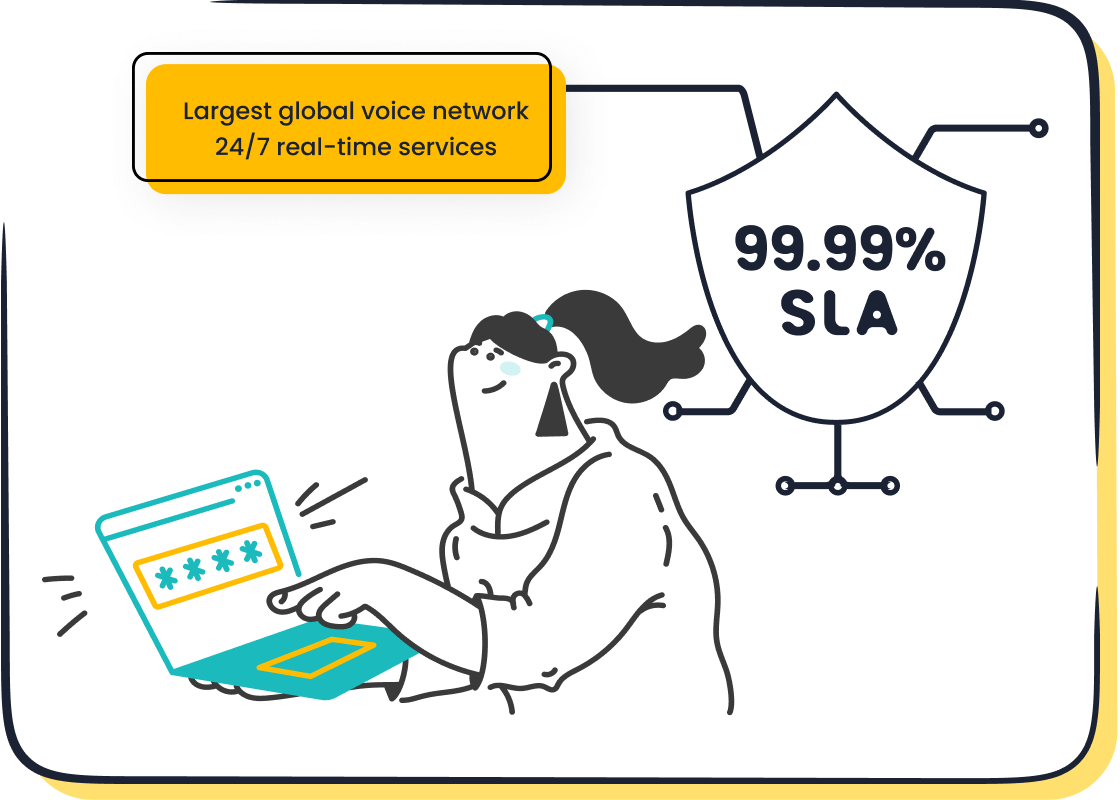
An inspiring performance dashboard gives you clear, real-time insights. It helps you see your performance against targets, boosting motivation. An effective kpi dashboard visualizes key metrics for agent performance. These include First Call Resolution (FCR) and customer satisfaction. This post provides 10 call center agent performance dashboard examples. Powerful tools are necessary for tracking each KPI. The Sobot call center, powered by Sobot AI, provides the real-time analytics needed for a great kpi dashboard, helping you build a better performance dashboard.
Dashboard 1: The Real-Time Agent Snapshot
This dashboard gives you immediate awareness of your current activities. It empowers you to self-monitor and make quick adjustments without waiting for a manager's report. Think of it as your personal command center for in-the-moment performance. A well-designed individual agent dashboard focuses on clarity, helping you see what needs your attention right now.
Core KPIs
To stay on track, your real-time dashboard should display a few essential metrics. You do not need dozens of numbers. You only need the right ones to guide your actions.
- Current Status: Shows if you are
Available,On a Call, or inAfter-Call Work. - Calls in Queue: Displays the number of customers waiting for an agent.
- Average Wait Time (Live): Tells you how long callers are currently waiting.
- Personal Adherence: This kpi tracks how well you follow your planned schedule.
- Average Handle Time (AHT): Measures the average time you spend on each interaction, from start to finish.
Visualization Ideas
The goal of this kpi dashboard is to provide information you can understand in three seconds. Complex charts will only slow you down. Instead, you should use simple and direct visuals. A good call tracking dashboard uses visual hierarchy to place the most important data at the top.
Clarity Over Complexity Your dashboard should reduce clutter. Avoid overwhelming yourself with too much information. A clean, focused layout helps you make faster, better decisions.
Use these ideas to build an effective view:
| Visualization Type | Description |
|---|---|
| Color-Coded Indicators | Use simple colors to show status instantly. Green can mean Available, while red can mean Busy or On a Call. |
| Single-Number Stats | Display key metrics like Calls in Queue as large, clear numbers. This makes them easy to see at a glance. |
| Simple Gauges | A gauge can show your adherence percentage or your current AHT against the team target. It provides quick context. |
These simple visuals give you the power to manage your own workflow effectively. They turn raw data into actionable insights, helping you improve your performance throughout the day.
Dashboard 2: The Quality Assurance (QA) Scorecard
While a real-time snapshot tracks your activity, the Quality Assurance (QA) Scorecard focuses on the quality of your interactions. This dashboard helps you see how well you meet company standards and customer expectations. It moves beyond speed and efficiency to measure the substance of your conversations. Your QA scorecard is a powerful tool for professional growth, highlighting your strengths and showing you exactly where you can improve your performance.
Essential Metrics
A comprehensive QA dashboard provides a balanced view. It connects your individual actions to the overall customer experience and business goals. You should track metrics across several key categories to get a complete picture.
| Metric Category | Primary Goal | Example Metric |
|---|---|---|
| Agent Performance | How effectively you handle interactions | Quality Score |
| Customer Experience | How customers feel about the service | Customer Satisfaction (CSAT) |
| Operational Efficiency | How productive the call center is | Average Handle Time (AHT) |
| Business Outcomes | How QA impacts company goals | Customer Retention Rate |
Focusing on metrics like First Call Resolution (FCR) is also crucial. A high FCR rate shows you are resolving issues effectively on the first try. This boosts customer satisfaction and reduces operational costs. All these essential KPIs should be easily accessible for a complete view.
Chart Suggestions
Visuals on your QA dashboard should tell a story. They help you quickly identify trends and understand your scores without digging through spreadsheets. The right charts turn complex data into clear, actionable feedback.
Visualize for Insight 🎯 Your QA dashboard should make it easy to spot trends at a glance. Use clear visuals to see how your scores change over time and where you excel.
Here are some effective ways to visualize your QA data:
- Bar and Line Charts: Use bar charts to compare your scores across different categories, like "Greeting" versus "Problem Solving." Use line charts to track your overall quality score trend over weeks or months.
- Gauge Charts: A simple gauge is perfect for displaying your current overall Quality Score. It instantly shows you where you stand against the target score.
- Color-Coding: Implement colors like red, yellow, and green to quickly signal performance levels. A green score indicates you are meeting or exceeding expectations, while red can highlight an area needing immediate attention.
Dashboard 3: The CSAT and Customer Service Dashboard
This dashboard puts the customer's voice at the center of your performance. It moves beyond internal metrics to show you how customers truly feel about their interactions. A great customer service dashboard helps you understand feedback, spot trends, and improve the overall customer experience. High satisfaction scores are important. They directly influence repeat business and customer loyalty.
Customer-Centric KPIs
Your customer satisfaction dashboard should track metrics that directly reflect customer happiness. These numbers tell you if your service is hitting the mark. A good score, often above 80%, shows customers are happy and likely to stay loyal.
- Customer Satisfaction Score (CSAT): This KPI measures short-term happiness with a specific interaction. You gather it with a simple question like, "How satisfied were you with your service today?"
- Net Promoter Score (NPS): This metric gauges long-term loyalty. It asks customers how likely they are to recommend your company to others.
- Customer Effort Score (CES): This measures how easy it was for a customer to get their issue resolved.
- Feedback Keyword Trends: This tracks the most common words or phrases customers use in their feedback.
Feedback Visualization
Visualizing feedback helps you quickly understand what customers are saying. Instead of reading hundreds of comments, you can see key themes at a glance. This turns raw data into clear actions for your next call.
Unify Your Data for a Clearer Picture 📈 A truly effective customer service dashboard pulls feedback from every channel. This gives you a complete view of customer satisfaction. Without a unified source, you only see part of the story.
Simple visuals work best:
| Visualization Type | How It Helps |
|---|---|
| Smiley-Face Ratings | Offers a quick, intuitive way for customers to rate their satisfaction. |
| Bar Charts | Shows the distribution of scores (e.g., how many 5-star vs. 1-star ratings you received). |
| Word Clouds | Transforms text feedback into a visual map. Larger words highlight what customers mention most often. |
Gathering this data is simple with the right tools. Sobot's omnichannel solution unifies feedback from voice, email, and chat into a single platform. This makes building a comprehensive kpi dashboard possible. For example, Samsung used Sobot to unify its service channels, helping them achieve an impressive 97% customer satisfaction rate.
Dashboard 4: The Efficiency & Productivity Tracker
This dashboard helps you measure how effectively you use your time. It focuses on efficiency metrics that show how much work you complete during your shift. Unlike a QA scorecard that measures quality, this tracker is all about quantity and speed. Proper tracking helps you identify areas where you can become more productive, helping you handle interactions smoothly without feeling rushed.
Productivity Metrics
To improve your efficiency, you need to monitor the right metrics. This dashboard highlights key indicators that show how you spend your time. Good performance here means you are balancing your workload effectively.
- Agent Utilization Rate: This shows the percentage of your logged-in time you spend on call-related work. It helps you see how much of your paid time is spent actively helping customers.
- Occupancy Rate: This measures the time you spend on calls and after-call work compared to your available time. A healthy rate is often between 80-90%, showing you are busy but not at risk of burnout.
- After-Call Work (ACW) Time: This is the time you take to update records after a call. Tracking this helps you see if processes or tools are slowing you down.
Comparison Visuals
Visuals on this dashboard should help you compare your metrics against benchmarks. This context shows you where your performance stands. It turns raw numbers into a clear path for improvement. Effective tracking allows you to see your progress over time.
Use Comparisons for Growth 🌱 Compare your stats against your own past performance or team averages. Use this information to set personal goals, not just to compete. The goal is continuous self-improvement.
Use these charts for clear comparisons:
- Stacked Bar Charts: Use these to see a breakdown of your time. You can compare your
Talk Time,Hold Time, andACW Timein a single bar. - Line Graphs: A line graph is perfect for tracking your Average Handle Time (AHT) over a week or month. You can see if your efforts to be more efficient are working.
- Bullet Charts: This visual is great for comparing your current metric (like Occupancy Rate) against a target. It clearly shows if you are on track.
Dashboard 5: The Gamified Performance Dashboard
This performance dashboard turns daily tasks into a friendly competition. It uses game-like elements to make your work more engaging and fun. Gamification is a powerful tool. Studies show it can increase agent engagement by 48% and retention by 36%. This approach helps you stay motivated by celebrating your achievements in real time.
Competitive Metrics
A gamified dashboard tracks your progress with clear, competitive metrics. These numbers help you see how your efforts contribute to team goals. You can earn points for great work and see your rank among peers.
- Daily 'Points': You earn points based on key metrics like First Call Resolution (FCR) and customer satisfaction scores. This system rewards you for both efficiency and quality.
- Rankings (Daily/Weekly): See where you stand on a daily or weekly leaderboard. This friendly competition encourages consistent high performance.
- Badges/Achievements Unlocked: You receive digital badges for hitting specific targets. This recognizes milestones and special accomplishments.
- Progress Towards Goals: Track your journey toward larger goals. This visual progress acts as a milestone that fuels your engagement.
Motivational Visuals
Visuals make the game exciting. A great gamified performance dashboard uses dynamic charts and icons to bring your achievements to life. These visuals should be easy to understand at a glance.
Level Up Your Engagement! 🚀 Compared to traditional methods, gamification can boost user engagement by 100%-150%. It turns routine work into a rewarding experience.
Use these visuals to build a motivating view:
| Visualization Type | How It Motivates You |
|---|---|
| Dynamic Leaderboard | Displays rankings with agent photos, creating a sense of community and friendly competition. |
| Progress Bars | Shows you how close you are to reaching a goal, like a weekly CSAT target. |
| Digital Badge Icons | Visually celebrates your wins. You can earn badges like 'Efficiency Expert' or 'Team Player' for your excellent performance. |
Dashboard 6: The Team Lead Overview
This dashboard gives you a bird's-eye view of your entire team's health and productivity. It moves beyond individual agent metrics to show you the bigger picture. You can use it to monitor collective progress, manage staffing effectively, and provide targeted coaching. This view helps you lead your team with data-driven confidence instead of guesswork.
Team Aggregate KPIs
To understand your team's overall health, you need to track aggregate KPIs. These metrics combine individual data to show how the team is functioning as a whole. You can group these KPIs into two main types.
- Quantitative KPIs: These are metrics you can measure with numbers. They give you objective insights into workload efficiency, task completion rates, and cost variance.
- Qualitative KPIs: These are more descriptive and often come from feedback. They help you measure things like team collaboration, communication effectiveness, and stakeholder satisfaction.
Set Clear Targets for Success 🎯 Use a simple color-coded system to track your KPIs. Green means you are meeting goals, yellow serves as a caution, and red signals that a metric needs your urgent attention. This helps you quickly see where to focus your efforts.
Staffing and Performance Views
A great team lead dashboard helps you identify coaching opportunities quickly. It gives you real-time visibility into your team's performance, making it easy to spot who is excelling and who needs support. This allows you to move from subjective feelings to objective, data-driven management.
You can use a performance matrix to categorize agents based on key metrics. This helps you tailor your coaching approach for maximum impact.
| Agent Profile | Description | Coaching Focus |
|---|---|---|
| Star Performers | High quota and strong pipeline | Focus on retention and leadership skills. |
| Consistent Builders | Strong pipeline but low quota | Help them improve closing techniques. |
| Inconsistent Performers | High quota but weak pipeline | Guide them in building a sustainable pipeline. |
| Coaching Needed | Low quota and weak pipeline | Provide comprehensive support and training. |
This targeted approach ensures every team member gets the specific guidance they need to grow. It turns your dashboard into a powerful tool for developing talent and driving results.
Dashboard 7: The Schedule Adherence Monitor
This dashboard shows you how well you stick to your work schedule. It is not just about being on time. It helps ensure enough agents are available to help customers without long waits. Following your schedule helps the whole team run smoothly and keeps customer satisfaction high. This view gives you a clear picture of your own reliability.
Adherence KPIs
To track your adherence, you need to understand a few key numbers. The main goal is to compare the time you were scheduled to work with the time you actually worked. This helps you see any differences.
| KPI Component | What It Means |
|---|---|
| Planned Time | The hours you are scheduled for tasks like calls, breaks, and training. |
| Actual Time | The real time you spend on your scheduled activities. |
| Unplanned Time | Any time spent on unscheduled activities, like unexpected system downtime. |
You calculate schedule adherence with a simple formula: (Time Worked as Scheduled / Total Scheduled Time) × 100.
What's a Good Score? 🎯 Most call centers aim for a schedule adherence rate between 85% and 95%. A score in this range shows you are a dependable team member.
Timeline Visuals
Visuals make it easy to see how your actual day compares to your planned schedule. Instead of looking at raw numbers, you can spot patterns at a glance. This helps you understand your work habits and improve your time management. Good visuals turn data into a simple story about your daily performance.
Here are some effective ways to visualize your adherence:
- Calendar View: This shows your schedule for the day or week. It uses colors to highlight any times you were not in adherence, like a late start or a long break. This gives you an intuitive overview.
- Real-time Reports: These reports display your adherence percentage as it happens. You can see your adherent time versus non-adherent time throughout the day, helping you make immediate adjustments.
- Agent Adherence Widget: A simple widget on your main dashboard can show your current adherence status. It uses conditional formatting, like changing from green to red, to alert you if you fall off schedule.
Dashboard 8: Inspiring Dashboard Examples for Sales Teams
An inspiring dashboard for a sales team is different from a service-focused one. It shifts the focus from efficiency and quality to revenue and growth. This dashboard helps you see how your activities directly contribute to the company's bottom line. It visualizes your sales pipeline, tracks your progress toward quotas, and highlights opportunities for upselling and cross-selling. These dashboard examples are designed to motivate you by connecting your daily efforts to tangible business results, making your performance clear and impactful.
Revenue-Focused Metrics
Your sales dashboard should highlight metrics that directly measure financial success. These numbers show the real value you bring to the company. Tracking them helps you understand your impact on growth and profitability.
Focus on Growth 💰 Your primary goal is to generate revenue. A dashboard that clearly displays sales growth and recurring revenue keeps you focused on what matters most.
Here are the key metrics to watch:
- Sales Growth: This shows if your sales are increasing over time. It is a direct measure of your success in hitting targets.
- New & Expansion MRR: This tracks Monthly Recurring Revenue from new customers and upsells. A healthy MRR shows consistent revenue generation.
- Upsell and Cross-Sell Prices: This metric highlights your success in selling more to existing customers. It is often cheaper to sell to a current customer than to find a new one.
- Sales Cycle Length: This measures how long it takes to turn a lead into a customer. A shorter sales cycle means you are closing deals faster.
Sales Funnel Charts
Sales funnel charts give you a visual representation of your sales process. They show how many potential customers move from one stage to the next. This helps you see where leads are dropping off, allowing you to improve your strategy. A clear funnel visualizes your entire pipeline at a glance.
Use these chart types to build a powerful sales view:
| Chart Type | How It Helps You |
|---|---|
| Funnel Chart | This is the classic choice. It shows the number of leads at each stage, from initial contact to a closed deal. |
| Waterfall Chart | This chart is great for showing how your starting pipeline value changes over time due to new leads, closed deals, and lost opportunities. |
| Bar Chart | Use a bar chart to compare the number of deals in each stage of the funnel. This helps you quickly see where most of your opportunities are. |
These visuals turn complex sales data into a simple story. They help you manage your pipeline effectively and focus your efforts where they will have the biggest impact.
Dashboard 9: The Agent Development & Coaching Dashboard
This dashboard is your personal roadmap for professional growth. It helps you and your manager identify strengths and pinpoint areas for improvement. Instead of waiting for annual reviews, you get continuous, data-driven feedback. This performance dashboard turns coaching into a collaborative process, building trust and helping you reach your full potential.
Opportunity-Spotting Metrics
This dashboard helps you spot skill gaps by analyzing your interactions. It uses specific metrics to show where you might need more training. This data gives you clear, objective insights into your performance.
- Transfer Rate: A high rate may show that you need more training on certain topics.
- Escalation Rate: Frequent escalations can point to a need for more advanced problem-solving skills.
- Sentiment Analysis Score: This score measures the emotional tone of your calls. It helps identify opportunities to improve empathy or de-escalation techniques.
A Foundation of Trust 🤝 This approach helps build trust between you and your manager. It creates an environment where you feel valued and actively involved in your own growth journey.
Trend and Goal Tracking
This part of the performance dashboard helps you visualize your progress over time. It makes tracking your development simple and motivating. You can see how your efforts lead to real improvements. This clear view helps you and your coach set SMART goals that are specific, measurable, and achievable.
Effective goal tracking allows for personalized coaching. For example, if your goal is to lower your Average Handle Time, the dashboard can show your progress week by week. This focused tracking helps you see what works. Companies that use data for coaching can save up to 15 minutes per session and see significant improvements in CSAT scores. This turns your development from a guess into a clear, guided path.
Dashboard 10: The All-in-One Call Center Agent Performance Dashboard
This final performance dashboard brings everything together. It combines your most important metrics from quality, efficiency, and satisfaction into a single, powerful view. This all-in-one call center agent performance dashboard gives you a complete picture of your performance at a glance. You no longer need to switch between different reports. These dashboard examples show how a unified view helps you understand your overall impact.
Composite Score
A composite score simplifies performance tracking. It combines several key metrics into one number. This score is often weighted, meaning some KPIs have a bigger impact on the final number than others. For example, customer satisfaction might be more important than handle time.
Your Overall Performance at a Glance 💯 A composite score gives you a quick, holistic summary. It helps you instantly see if you are on track without getting lost in details.
This single score makes it easy to understand your overall contribution. It provides a clear benchmark for your daily efforts and long-term growth. This is a key feature of a great kpi dashboard.
Holistic KPI View
A holistic view shows you the full story behind your composite score. This customer service dashboard displays a balanced mix of your most critical metrics. It helps you see how different areas of your performance connect. Good tracking of each kpi is essential for a complete customer service dashboard.
This performance dashboard should include:
- Top 3 KPIs: Displays your most important metrics, like CSAT, FCR, and AHT.
- Recent Customer Feedback: Shows a snippet of a recent customer comment.
- Adherence Status: Gives you a quick update on your schedule adherence.
| Visualization Type | How It Helps |
|---|---|
| Balanced Scorecard | Organizes your KPIs into a clean, grid-like layout for easy comparison. |
| Gauges & Callouts | Use gauges for scores like CSAT and large numbers for metrics like FCR. |
| Small Trend Graphs | Show your performance trends for key metrics over the past week. |

Building a powerful call tracking dashboard like this requires integrated data. Sobot's Voice/Call Center provides the necessary tools. Its Unified Workspace and Monitoring and Analysis features bring all your data together, making a truly all-in-one call center agent performance dashboard possible. This helps you see the complete picture of your performance and its impact on the customer experience and overall satisfaction.
The most effective call center agent performance dashboard is one you tailor to specific goals. You might focus on efficiency, quality, or sales. A great performance dashboard turns data into clear, actionable insights that boost your performance. This inspiration comes from clarity. A modern call center agent performance dashboard provides this clarity, helping you improve your daily performance.
Ready to build your own inspiring performance dashboard? Explore how Sobot's Voice/Call Center solution can provide the real-time analytics and unified data you need. Start by identifying your top 3-5 critical KPIs and see how a powerful platform can bring them to life.
FAQ
What are the most important KPIs for a performance dashboard?
The most important KPIs depend on your goals. However, most dashboards focus on Customer Satisfaction (CSAT), First Call Resolution (FCR), and Average Handle Time (AHT). These three metrics give you a balanced view of quality, effectiveness, and efficiency in your performance dashboard.
How often should I check my dashboard?
You should check your real-time dashboard throughout your shift to manage your current tasks. For trend-focused dashboards like QA or development, reviewing them weekly with your manager is a good practice. This helps you track your long-term progress effectively.
How does a dashboard help me improve?
A dashboard gives you instant, visual feedback on your work. You can see your strengths and find areas for improvement without waiting for a report. This empowers you to take control of your own professional growth and make immediate adjustments.
See Also
Elevate Call Center Performance: The Power of Effective Monitoring
Discover the Best Call Center Analytics Software of 2024
Implementing Top Quality Management Practices for Your Call Center
Mastering Live Chat: A Guide to Effective Agent Management
Unveiling the Leading Speech Analytics Tools for Call Centers in 2024